tipperaryred
-
Posts
596 -
Joined
-
Last visited
-
Days Won
24
Content Type
Profiles
Forums
Events
Everything posted by tipperaryred
-
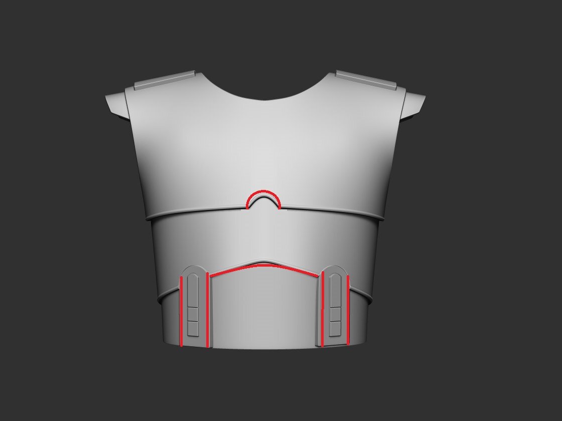
 You're definitely very close! Just a few tweaks needed I think: - Notch at the bottom of the upper chest plate needs to be less pointed. More like a semi circle shape. - The bottom edge of the lower chest plate needs to have a more gentle curve. Less pointed at the top. - If the details on the abdominal plate are embossed, they should only be raised up VERY slightly, if at all. The reference images don't really show any elevation, so we could even state that these can be painted on or applied with decals. What do you think? You can see in the image below that the details on the abdominal plate don't stand out from the armour at all: - Finally, if you do cast those panels onto the abdominal plate, I think they need to be slightly narrower. The lower chest plate needs two semi-circular notches cut into the bottom to line up with where those panel details appear on the abdominal plate.
-
It's difficult with animated costumes, but my instinct would be that it looks much the same as the animated TKs and Clones. Plus the whole point from a story perspective was Imperialising Mandalorians, so it would make sense that their armour would be made to resemble TKs.
-
Great start. I'll look in more detail tomorrow, but I can see a correction already with the designs on the lower plate. The designs are only slightly raised/embossed, and are below the middle plate above them. This middle plate has two semi circular cut outs that line up with the design below (similar to the cut out in the middle of the upper chest piece).
-
Purge Trooper (Phase II) - Kenobi - Discussion
tipperaryred replied to nanotek's topic in Purge Trooper Phase II (Kenobi)
Brilliant mate, I understand exactly now. The original description had me picturing three shorter panels side by side, running horizontally along the bottom edge; not three panels stacked above each other below each of the large panels. I'll go back over the wording after work to see if a tweak is worthwhile. And yes, that would make a fantastic picture of the kama for the CRL, thanks a million. Will also take a look at the pauldron text after work, thanks for making a start! -
Purge Trooper (Phase II) - Kenobi - Discussion
tipperaryred replied to nanotek's topic in Purge Trooper Phase II (Kenobi)
Quick tweak of gloves, with changes in orange. Mainly I'm adding from the Rogue One TK CRL, as we're dealing with the same design. Thanks for the great start. --- Gloves are based on the Rogue One TK style gloves. The base material of the gloves will be a black synthetic material similar to Lycra, Spandex, Elastane, or Nylon. The palms and fingers should feature a black leather, leather-like or Nomex material with no visible logos, textures or designs, to match reference photos. The glove extends under the forearm armor. The cuff is made from an black elasticated fabric. The hand plate is attached to back of glove and is black to match the rest of the armor. OPTIONAL Level two certification (if applicable): The palm has 5 raised padded sections to match reference photos. -
Purge Trooper (Phase II) - Kenobi - Discussion
tipperaryred replied to nanotek's topic in Purge Trooper Phase II (Kenobi)
Ok folks, thanks a million for the patience, and the continuing hard work. I've reviewed everything now and it all looks great. I've updated the main CRL thread with all of our currently finalised text: That's not to say that we can't come back to any of those if changes are identified or new references unearthed, but for the time being we'll draw a line under those green items and continue with the rest. In all of the text there was only one part that confused me, so great work on keeping the wording so clear! For the kama exterior, we have a description of 4 large panels at the top, and 3 small pleated panels running along the bottom. However it says that the smaller panels match the width of the larger panels. If that is that case, shouldn't there be the same number of each? Or am I completely misunderstanding that part? Do we have any good references that explain this visually? I'll help out with finishing up the gloves with you next. -
Thanks a million Ryan, and my own apologies for being AWOL. Going to set aside a few hours later this week to dig in on this and a couple of other WIPs!
-
Purge Trooper (Phase II) - Kenobi - Discussion
tipperaryred replied to nanotek's topic in Purge Trooper Phase II (Kenobi)
Apologies for being AWOL, real life has been demanding of late. I should be able to work my way through this later this week. Thanks a million for continuing to drive on. -
Purge Trooper (Phase II) - Kenobi - Discussion
tipperaryred replied to nanotek's topic in Purge Trooper Phase II (Kenobi)
Perfect. Yes, the spats will probably have their own place in the CRL as hard parts in that case. If they had been leather or fabric we could have just included them in the boot text. The only real bearing they have on the boots is that they obscure the lower part of the boot seams. The FOTK mentions "a seam down both sides of the front that swoops out to the side of the foot", but given the poor reference images and the amount that's hidden by the spats, I'd say it's safest to leave any mention of seams out of the text? -
I just added in the bit about the bevelled edges, as that seems to be a very distinctive feature: Otherwise I think that's spot on. More than happy to proceed!
-
Purge Trooper (Phase II) - Kenobi - Discussion
tipperaryred replied to nanotek's topic in Purge Trooper Phase II (Kenobi)
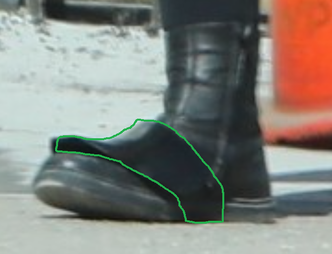
Working off Max's last draft, changes in orange and my own notes/comments in green. Just to start off, I'd fully agree that the R1 black trooper boots from Keep Trooping are a solid match. I'd also agree we want to keep this as open and flexible as possible for Lvl1. Boots are above ankle height, similar in style to FOTK boots. (I think this is keeps things simpler, as "New Era" will definitely confuse some people.) Flat black soles, without a heel. (NB. While the sole should be flat in profile, we don't need to say anything specific about the tread. There *could* be a small tread there for all we know - none of the visual references prove differently). Boots are made from leather or a leather like material. Boots have a full height inner zipper. (I removed any mention of elastic for Lvl1 as again, this could cause confusion). Zipper must be black in colour. OPTIONAL Level two certification (if applicable): The wearer's inner side of the boots have zippers and no side elastic. The sole is is flat without a heel (I think this feature is important enough that it should be required at Lvl1, so does not need to be repeated here. Certainly it is a basic Lvl1 requirement for both the FOTK and the R1TK boots) Finally, I don't think there has been any mention of the spats yet? These are extremely different in style to the FOTK spats, as they sit only on the instep and are attached under the boot. The FOTK spats sit below the ankle and are strapped around behind the ankle. Do we know whether these are leather, fabric, or hard plastic attached to elastic/fabric?
-
Purge Trooper (Phase II) - Kenobi - Discussion
tipperaryred replied to nanotek's topic in Purge Trooper Phase II (Kenobi)
Sorry for not being as active in recent weeks, and thanks a million for keeping the ball rolling forwards. I should have a little free time the next few days, so I'll make sure a detailed catch-up here is at the top of my to-do list. -
Welcome! Yes indeed, once we have Gar a little further along I'll adapt it to the grunt CRL too. As Kevin said, there's really only minor paint differences for the most part. Enjoy building your Jawa, and we look forward to seeing you work on the super commando afterwards!
-
Text altered to remove the "seamless" mention. How is the rest looking? Chest, Shoulder and Abdominal Armour (Second Draft) Armour shall be painted white, with a red inverted triangle design painted over the upper chest and shoulder to match the visual references. This red paint scheme continues over the shoulders and is mirrored on the back plate. Oblong shoulder pads shall be painted white. Paint shall be weathered to match the visual references. Segmented construction, wrapping completely around the wearer. White oblong shoulder pads sit above both shoulders, made of the same material as the chest armour. Edges should be rounded. The curved shoulder armour can be cast as a part of the upper chest, or attached underneath. It should be of the same material as the chest armour in either case, and painted the same red used on the chest armour. The upper and lower chest pieces may be cast together, or separately so that the lower chest sits under the upper chest. Semi-circular notch in the centre front of the upper chest. White circular detail with black outline on the front left of chest. Two semi-circular notches at the bottom front of the lower chest. Abdominal plate is overlapped by the lower chest, and features two rectangular details that align with the notches at the bottom of the lower chest. All detailing matches the visual references.
-
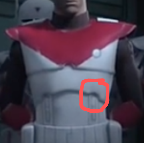
Chest Armor Realistic style Chest Armor. Armor is painted matte or satin black. Two detail slots on the lower outside edge of the right pectoral area. Would "pill shaped recesses" work? Chest and back armor match together at the sides with no open gap. A seam line is present. Shoulder straps are slotted into the detail ridges of the top connection points. Do we have any references for the armour without the pauldron being worn? Is it worth mentioning the bevelled edges - both at the bottom of the armour and where the chest plate slopes down to the abdominal plate?
-
Purge Trooper (Phase II) - Kenobi - Discussion
tipperaryred replied to nanotek's topic in Purge Trooper Phase II (Kenobi)
I did go frame by frame over the series and the behind the scenes special for more shots, but those in the reference gallery were the only ones of any use. So we might just need to stick with the usual velcro style closure in the absence of anything contradictory. In saying that, I'd still feel happier about it if anyone from the set was able to corroborate. -
Agreed, nice and simple there - no changes needed to my eye. Cheers Ryan!
-
Purge Trooper (Phase II) - Kenobi - Discussion
tipperaryred replied to nanotek's topic in Purge Trooper Phase II (Kenobi)
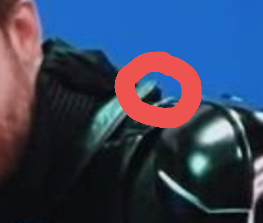
My reading of it would be that there's a pop or velcro joining it towards the back of the left shoulder: The neck hole looks simply too small for it to be possible to pull the entire thing down over the head as one fully enclosed piece. I would assume by default that it follows the pattern for other SW pauldrons and fastens over the left shoulder. Do we have any additional references that show this area clearly?
-
Nice work! I'd agree that looks great as a match 👍
-
Purge Trooper (Phase II) - Kenobi - Discussion
tipperaryred replied to nanotek's topic in Purge Trooper Phase II (Kenobi)
Perfect 👍 Yes, good start on the pauldron too. I've two weddings in two days with a lot of traveling now, but I might get some time to look with some luck! -
I think there's always going to be a little extra latitude with colours when building from animated sources. I think whether it's white/light grey or one of many shades of maroon, I'd be surprised if too many GMLs caused trouble. I think all three colours you have there could work. On the Amazon one the ribbing looks slightly less obvious, but it might just be the photo they used. For the grunt I'd say yes, it's likely you'd want the top to match the trousers. When I get more time, I'm going to sit down and prepare some text for that too using what we've agreed on for Gar so far.
-
Yes, that was some wording I think I took from the MMCC text originally, but it did catch my eye too. Realistically there's always going to be a seam if you look hard enough, so we might just tweak that wording down to be less demanding.
-
Purge Trooper (Phase II) - Kenobi - Discussion
tipperaryred replied to nanotek's topic in Purge Trooper Phase II (Kenobi)
While I'm in the process of catching up, I'll have a quick tweak of the neck seal too. Thanks a million for pressing on with this Scott. Even if the bib is worn inside the undersuit, I'd still suggest insisting that it be ribbed in case any of it shows above the undersuit's neck. Neck Seal Lvl:1 Black with horizontal ribs, fitted to the wearer, and extending from the base of the neck to conceal the entire neck. A bib may extend from the bottom of the neck seal to ensure that the entire neck opening of the chest and back armour is covered. The bib should be made from the same ribbing material as used on the undersuit. -
Purge Trooper (Phase II) - Kenobi - Discussion
tipperaryred replied to nanotek's topic in Purge Trooper Phase II (Kenobi)
And just to make sure we get the suit finalised and agreed upon, I've just added a few small tweaks in purple below to increase clarity. Let me know if you are happy for us to add this to the final text. Lvl:1 Base undersuit is made from a black, non-textured material, either one or two-piece construction with no visible logos/designs. Any zippers must not be visible when the full costume is worn. Ribbing material must be present anywhere the undersuit is visible when armour is worn on top. All ribbing must be horizontal. Each rib and groove can be no wider than 3mm or 1/8 inch (one rib and one groove equal 6 mm or 1/4 inch). Lvl:2 The undersuit is one piece construction . A zipper runs along the entire front and encloses the front of the undersuit. This should not be visible when the full costume is worn. Non-visible areas of undersuit (eg. forearms, center of thighs, waist and calves) do not have ribbed material present. -
Purge Trooper (Phase II) - Kenobi - Discussion
tipperaryred replied to nanotek's topic in Purge Trooper Phase II (Kenobi)
Thanks for tidying up the helmet Ryan, that looks much better. As Scott mentions, the teeth are definitely not cut out so I'll make that one final alteration below and we should have the helmet sorted: Helmet Gloss black in color, consistent with the rest of the costume. Lens must be sufficiently dark enough to obscure the costumer's eyes. The eye lens is one continuous piece with a mirrored red tint. The central vocoder (chin detail) may be molded as a separate piece and is inserted into a recess in the mouth plate or it may be molded as a part of the mouth plate, but with a prominent recessed outline to create the appearance of being separate. The top part of the vocoder is rectangular in shape, with two clipped dog ears on the top corners. A smaller plate of identical shape sits on the top of this panel, leaving a narrow margin around each edge. There is also an angular cut out at the top of the right edge of this plate. A second rectangular plate sits on the top of the first, covering approximately 40% of bottom of the lower plate. There is a raised horizontal line on the lower left side of this top plate. There is a small square recess underneath this raised horizontal line. The main body of the vocoder sits below the panel described above. 9 raised ridges run vertically across the vocoder. Angled wings at the top of either side of the vocoder ridges, each slightly under approximately 50% of the length of these ridges. These wings angle down to the rest on top of the main mouth plate. Square profile side tusks run back from the lower edges of this front plate. Recessed rectangular metallic silver screens are inset into the greeblie in the front of each side tusk. Each greeblie has a raised ridge on 3 sides, angling up from the bottom side of the greeblie. 6 pill shapped symmetrical recessed stripes on each tusk, with the bottom of the recesses filled with red to match the pauldron, belt accessories and left bicep armor. A small raised horizontal rectangle with a recessed line is located below the vocoder. The frown must have 10 raised teeth, with angled recesses painted silver. There is a silver rectangular plate on the nose, between the teeth and the front plate, with a silver half moon greeble on top. This plate is recessed below the angled face plates on either side. The half moon greeble is level with the adjacent face plates. There is symmetrical recesses with a pill shaped greeblie on each side between the side tubes and the cheeks. The top of the greeblies are split in half with the top half being flat and the bottom half having 4 raised ridges that are level with the flat half. There are sharp angular cheekbones sculpted into helmet face plate running in a triangular shape below the lens opening. There are 3 raised ridges run from the center of the brow, over the top of the helmet and down to the rear center of the helmet skirt. The central ridge is approximately 2.5 times wider than the ridges to either side of it. A winged greeblie sits below the center of the brow ridge and above the eye lens. The top of the helmet is separated from the face plate by a horizontal band running above the brow. A groove separates the top of the helmet and the rear skirt, running across the back of the helmet, meeting the brow band on either side. The side greebles (communicators/range finders) are attached on top of the joints between the band and the ridge on either side of the helmet. Symmetrical rectangular greebles (communicators/range finders) with semi-circular ridges underneath, present at the back of each side of the brow band, situated on top of the point where the front band meets the rear groove. The greeblie contains two raised and stacked squares, each with a circular LED or sculpted imitation located near the front, and a single recessed line in the shape of a square outlining the back two thirds of the greeble. OPTIONAL - The top and bottom may be lit using LEDs. The top LED must be a warm pale yellow (similar to a warm incandescent bulb), the bottom LED must be red. There are 2 small pill shaped double indentation in the bottom corners of the faceplate, under each ear. The rear indentation is vertical and slightly longer than the front indentation that angles toward the front of the helmet. OPTIONAL Level two certification (if applicable): The central vocoder (chin detail) shall be molded as a separate piece and is inserted into a recess in the mouth plate. The aforementioned greeblie on the back of each side of the brow band must have the top and bottom lit using LEDs. The top LED must be a warm pale yellow (similar to a warm incandescent bulb), the bottom LED must be red.